Metaroll
A steel manufacturer walks into a design brief. The brief says: "We're going public. We need a new website." What it actually means: "We've been in this industry for decades, we move serious metal, and our current digital presence looks like it was made in 2009 by someone's nephew." No shade. That nephew tried his best.... So here is how we did it!
Year
2025
Scope
Branding, Web Design
Industry
Metaroll TMT
Duration
4 Months
//WHAT EVEN IS THIS
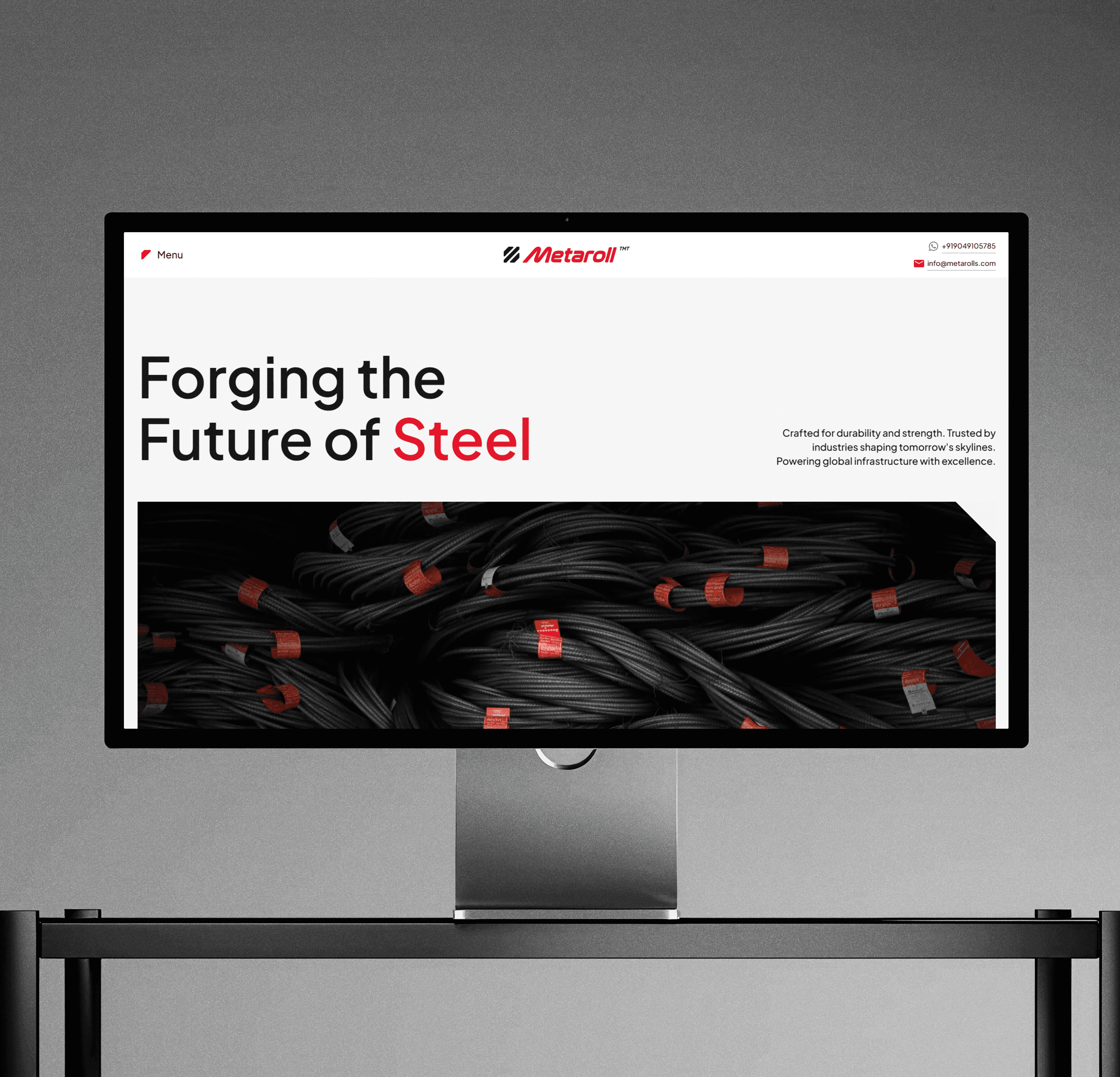
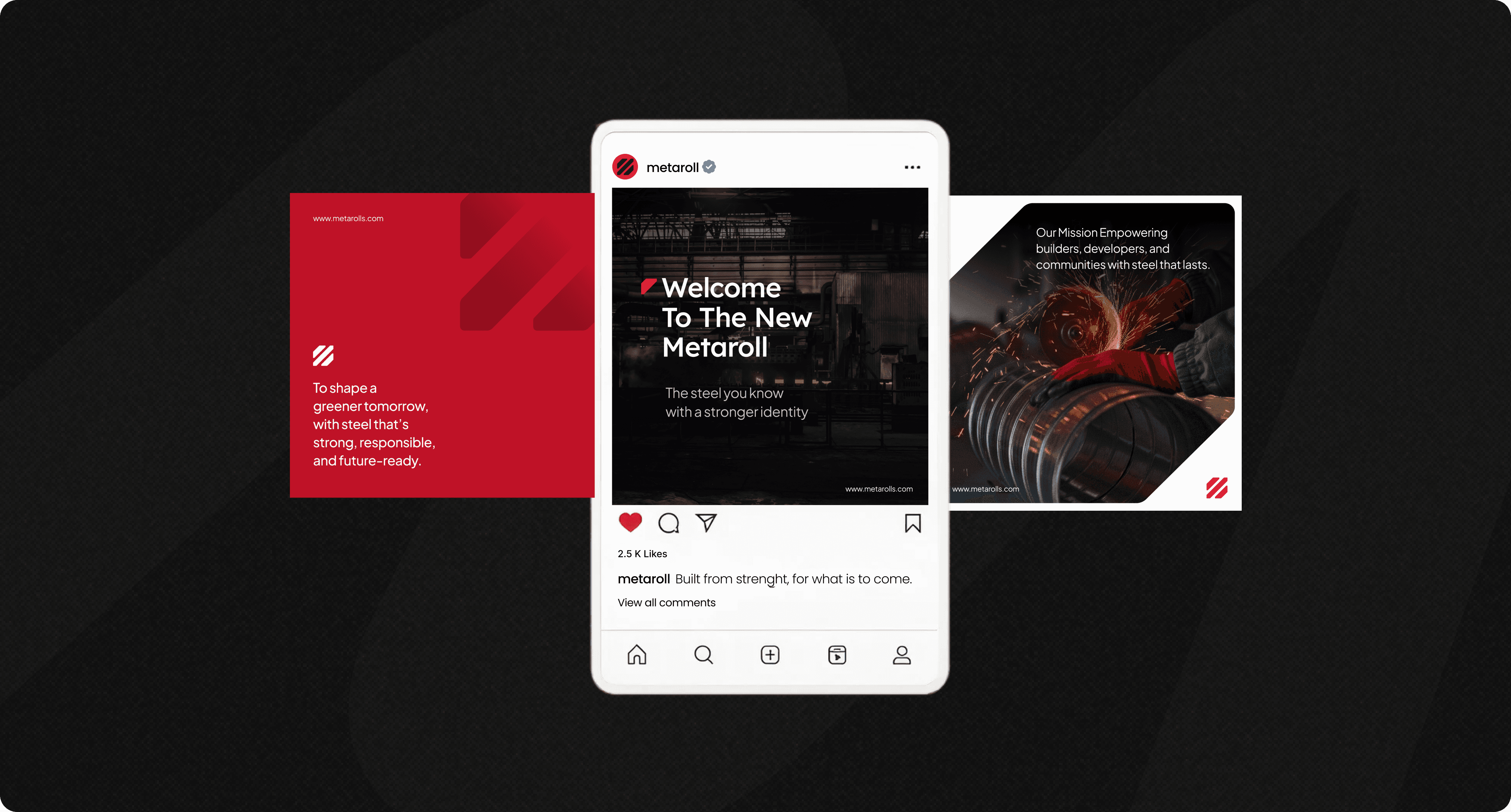
Metaroll is a major player in the steel sector, TMT bars, heavy manufacturing, the kind of infrastructure that holds up buildings you walk into every day without thinking about. They were heading into an IPO. Which means suddenly, the audience wasn't just contractors and site engineers. It was institutional investors, analysts, and people in suits who form opinions about companies in the first 8 seconds of landing on a webpage. The existing brand wasn't ready for that room. So we rebuilt the whole thing. Brand identity. Visual language and the Website.
//THE PROBLEM OR
(HOW TO LOOK LIKE YOU MEAN BUSINESS WHEN YOU HAVEN'T HAD TO BEFORE))
Metaroll didn't have a bad brand because they didn't care. They had a bad brand because they never needed a good one!. Their work spoke for itself in the industry.
But an IPO is a different game. You're not pitching to people who know steel. You're pitching to people who know spreadsheets.
The Problems:
The existing brand felt regional, almost hyperlocal, great for winning contracts in the area, awkward when you're trying to look national
Nothing communicated scale. Visiting the website gave zero sense of how much steel these people actually move
Corporate investors and rural site contractors are wildly different audiences, The brand was accidentally speaking only to one
//WHAT WE ACTUALLY DID
This one wasn't just UX. It was brand-up!, a real one.
Logo revamp (the previous one had... history).
Full visual identity system (typography, color, iconography, tone).
Scalable web framework built for both corporate and contractor audiences.
Micro-interactions that made the site feel substantial without feeling slow.
Developer handoff, documented so well that for once nobody had to call me back.
//THE DESIGN MOVES
Bold without being loud:
Steel is heavy. The visual language had to feel that weight without crushing the user. We leaned into dark tones, strong typography, and a lot of intentional whitespace. Confidence, not aggression.Two audiences. One interface:
The site had to work for a Mumbai investor opening it on a MacBook and a site contractor opening it on a budget Android in direct sunlight. High-contrast typography, clear iconography, plain language, all of it serving both, without either feeling like a compromise.Investor Relations front and center.
IPO context changes hierarchy completely. The first thing institutional stakeholders need to see is scale, credibility, transparency. So we surfaced Manufacturing Excellence and Investor Relations sections immediately, not buried three scrolls deep where they'd never find it.
This sounds boring. It is genuinely important. When a corporate inquiry lands in the same inbox as a small contractor request, things go sideways fast. We designed lead forms with smart routing so the right people get the right calls.
//DID IT WORK?
The brand went from looking like a local contractor's business card to something you wouldn't be embarrassed to put in front of an investment committee.
The website now holds its own in the room it was built for, and still makes sense to the contractor on-site who just needs to find the product spec sheet without a PhD in navigation.
( Still here? Alright. Here's where it got complicated )
The pretty slides don't show you the arguments. This part does.
// THE HARD DECISIONS NOBODY ASKS ABOUT
Industrial aesthetic vs. approachability (A constant tug of war)
The first few directions we explored leaned hard into the heavy industry aesthetic. Dark, raw, almost brutalist. It looked incredible on a 27-inch monitor in a design presentation. It was completely hostile to the rural contractor trying to download a product datasheet on a slow connection.
We had to dial it back :(
Not abandon the aesthetic, but make it serve function. The final direction kept the boldness but introduced enough breathing room and clarity that it worked at every screen size, every lighting condition, every literacy level. Getting there meant letting go of some genuinely cool design directions that just weren't right for the job.
The logo (Touching something nobody wants you to touch)
Logo revamps on legacy companies are political. There are people who've stared at that mark for 20 years. It means something to them that has nothing to do with design. The approach here was evolution, not revolution. Retain the equity, the recognition, the familiarity, but sharpen it. Clean up the geometry. Improve legibility at small sizes. Make it work on a hard hat and a prospectus cover. Convincing stakeholders that "we're not erasing your identity, we're upgrading it" is as much a communication design problem as it is a visual one.
Typography doing the heavy lifting.
When you simplify an interface aggressively, fewer decorative elements, cleaner layouts, typography stops being a supporting player and becomes the entire personality of the brand. Every font choice, weight, size relationship, and line-height decision was carrying more than it usually does. One wrong call and the whole thing tips from "industrial authority" to "budget corporate template."
// THE LOOPHOLES (THINGS THE BRIEF DIDN'T WARN ME ABOUT)
Multilingual content was technically out of scope.
In practice a company this size, operating across regions with contractors who don't primarily read English it's a real gap. The information architecture was built with localization in mind, but the actual translated content? Parked for a later phase.
Accessibility for outdoor environments is also genuinely unsolved at an industry level. We optimized for contrast and legibility, but a proper outdoor accessibility audit (testing under different light conditions, different device brightness settings) this is something the product still needs.
//WHERE THIS GOES
The foundation that was built here was designed to scale, not just in pages, but in markets.
Multilingual rollout for regional markets. A dedicated investor portal with live data integration. A product catalogue system that contractors can actually search without calling the sales team. A brand guidelines document comprehensive enough that the next agency doesn't have to start from scratch.
The revamp was the beginning of Metaroll's digital identity, not the end of it.
Version 1.0 is live! The rest will rollout in future updates!