PhonePe
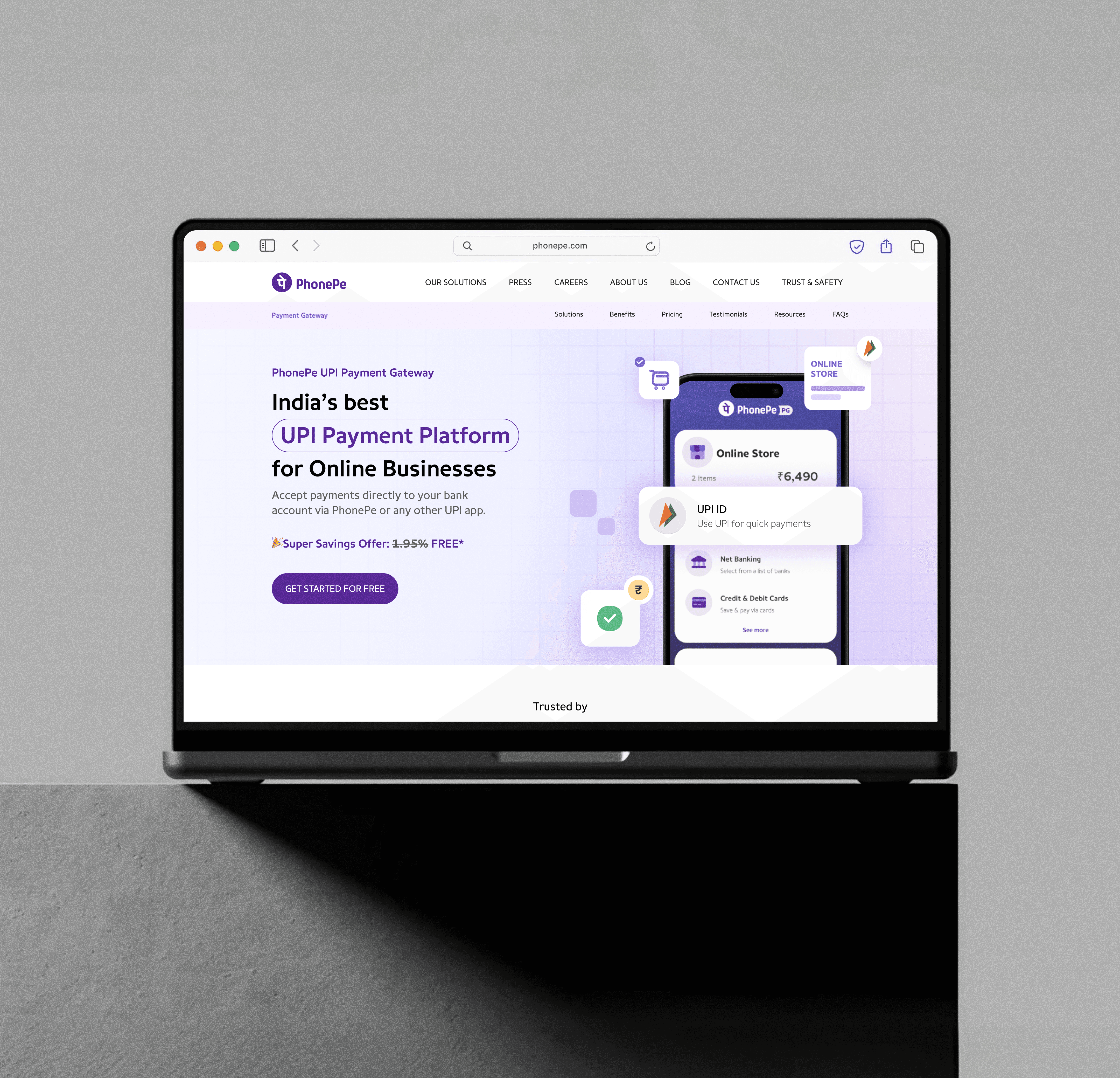
At some point today, someone in India paid for something using PhonePe. Actually, scratch that. A lot of someones….. Like if statistically speaking, while you're reading this sentence, a transaction just went through. That's the scale we were designing for. Not "our users" as a persona in a Figma file. Real people. Millions of them. Daily. Across payment gateways, transit systems, hardware speakers, and many many more….
Year
2025
Scope
Web Design, Design Systems
Industry
Fintech
Duration
Ongoing
//COME ON, WHO DOESN'T KNOW PHONEPE
PhonePe is one of India's biggest digital payments platforms, consumer and merchant side both!
UPI payments, insurance, investments, travel, transit, lending, credit cards. If money moves in India, there's a decent chance PhonePe is somewhere in that chain. This wasn't a single product redesign. It was ongoing design work across multiple verticals simultaneously. The Payment Gateway, Speaker 2.0, and Travel & Transit are just a few products to count off…
//THE PROBLEM
( OR WHAT HAPPENS WHEN A PRODUCT GROWS FASTER THAN ITS DESIGN SYSTEM)
PhonePe didn't have bad design. It had too much design. Constantly accumulated across years of rapid growth, different teams, different moments in time, all slightly inconsistent with each other.
The result:
Checkout flows carrying cognitive load they had no business carrying.
UI patterns that meant different things in different parts of the product.
Speaker 2.0 product pages that weren't communicating what the hardware actually did.
Travel and transit flows designed by people who had not recently tried to book a bus ticket.
The interface was working against the user instead of for them.
//WHAT I ACTUALLY DID
This was a multi-vertical engagement (Still ongoing)
UX flow design across Payment Gateway, Speaker 2.0, and Travel & Transit.
Visual language and UI design consistent with PhonePe's existing brand system.
Custom illustrations that explained complex product concepts without words.
Design system alignment. (Building scalable components that actually got reused).
Micro-interactions that made high-stakes moments feel less stressful
Developer handoffs, with tight deadlines.
//THE DESIGN MOVES
Kill the noise at the critical moment.
The payment step is not where you want users thinking. It's where you want them doing. We stripped back everything non-essential from key checkout screens — competing CTAs, secondary information, visual decoration, so the primary action was impossible to miss and impossible to second-guess.Trust signals are not decoration. Treat them like information.
A merchant completing a payment integration needs to feel like PhonePe has their back. That means surfacing the right signals, security indicators, clear error states, confirmation language at exactly the right moments. Not as an afterthought. Not buried in footnotes. Front and centre, when it matters.Progressive disclosure for the complex stuff.
PhonePe's merchant flows involve genuinely complex information. Integration options, pricing tiers, compliance requirements. Dumping all of it on one screen is a great way to make merchants close the tab. We layered the information: show what's needed to take the next step, and reveal depth only when the user asks for it.
//DID IT WORK?
When you're designing at fintech scale, "did it work" isn't a simple question with a simple answer.
But what I can say is, the components got reused. Across verticals, across teams, the system held. The design-to-development handoff was clean enough that things actually got built the way they were designed which, if you've ever worked in product, you know is not a given. :)
At the scale PhonePe operates — small UX improvements compound into very large real-world impact.
( Still here? Good. This one gets technical... )
Designing for one user is hard. Designing for millions, across multiple products, simultaneousyl!
that's a different game entirely. Here's what that actually looks like…
// THE HARD DECISIONS NOBODY ASKS ABOUT
The design system tension. (contribute vs. consumption)
Working inside an existing product at PhonePe's scale means you're always navigating a question: do you build new components or adapt existing ones? Go custom and you risk fragmenting the system. Stay within the system and sometimes the system just doesn't have what you need.
The call had to be made every time. New component only when the existing system genuinely couldn't serve the use case and even then, built to system spec so it could eventually be absorbed. It's slower than just designing what looks right. It's the only way to keep a product of this scale coherent.
Designing for trust in high-stakes moments.
Payment UX is fundamentally about managing anxiety. Every step between "I want to pay" and "payment confirmed" is a moment where something could go wrong in the user's mind, even when nothing is actually going wrong. Designing those moments means thinking about what the user is afraid of, not just what they're doing.
Error states, loading states, confirmation screens, these aren't afterthoughts. In a payment flow they're as important as the primary interaction. We spent disproportionate time on states that most users will rarely see, because the ones who do see them are often the ones closest to abandoning.
The Speaker 2.0 challenge (Communicating physical value digitally)
How do you make someone understand that a piece of hardware is better than what they have, without putting it in their hands? This is a genuine design problem that doesn't have a clean UX solution. Static screens aren't enough. The answer was motion design and sequential storytelling. showing the device in context, showing the upgrade in action, letting the product demonstrate itself rather than describe itself.
This is closer to product marketing design than product design, The line blurs when the product is physical.
// THE LOOPHOLES (THINGS THAT ARE STILL ON THE LIST)
Consistency across teams is never truly solved, its only managed. The components we built will drift over time as new teams touch them, as product priorities shift, as the system evolves. Without a strong design system governance process, fragmentation creeps back in. That's not a design failure, it's a product org problem. But it's real, and it's ongoing.
The accessibility audit across all three verticals was partial. We designed to accessibility standards, contrast, touch targets, readable hierarchy, but a full audit with assistive technology testing across the range of devices PhonePe runs on? That's a standing gap in fintech design broadly, not just here.
And the personalisation layer, the idea that a merchant who's been on the platform for three years should see a different experience than one who just signed up — that's a design problem that got flagged and parked. The architecture exists to support it. The design work hasn't caught up yet.
//WHERE THIS GOES
This engagement is ongoing. Which means the list of what's next is a live document, not a closed chapter.
And beyond that, as PhonePe moves further into insurance, investments, lending, and credit, each new vertical is a new design problem with the same underlying constraint: millions of users, high stakes, no room for confusion.
The scale doesn't get smaller. So the design work doesn't stop. :D