Progenesis IVF
People don't casually browse fertility clinic websites. They find them at 1am. After their third failed attempt. After a conversation they didn't want to have with someone they love. After months, sometimes years, of hoping things would just... sort themselves out. They arrive already exhausted. Already scared. And the first thing most clinic websites do is greet them with a stock photo of a smiling couple and a "Book Now" button. That's the problem we had to fix!
Year
2026
Scope
Web Design, AX Design
Industry
Healthcare
Duration
6.5 Months
//WHAT EVEN IS THIS
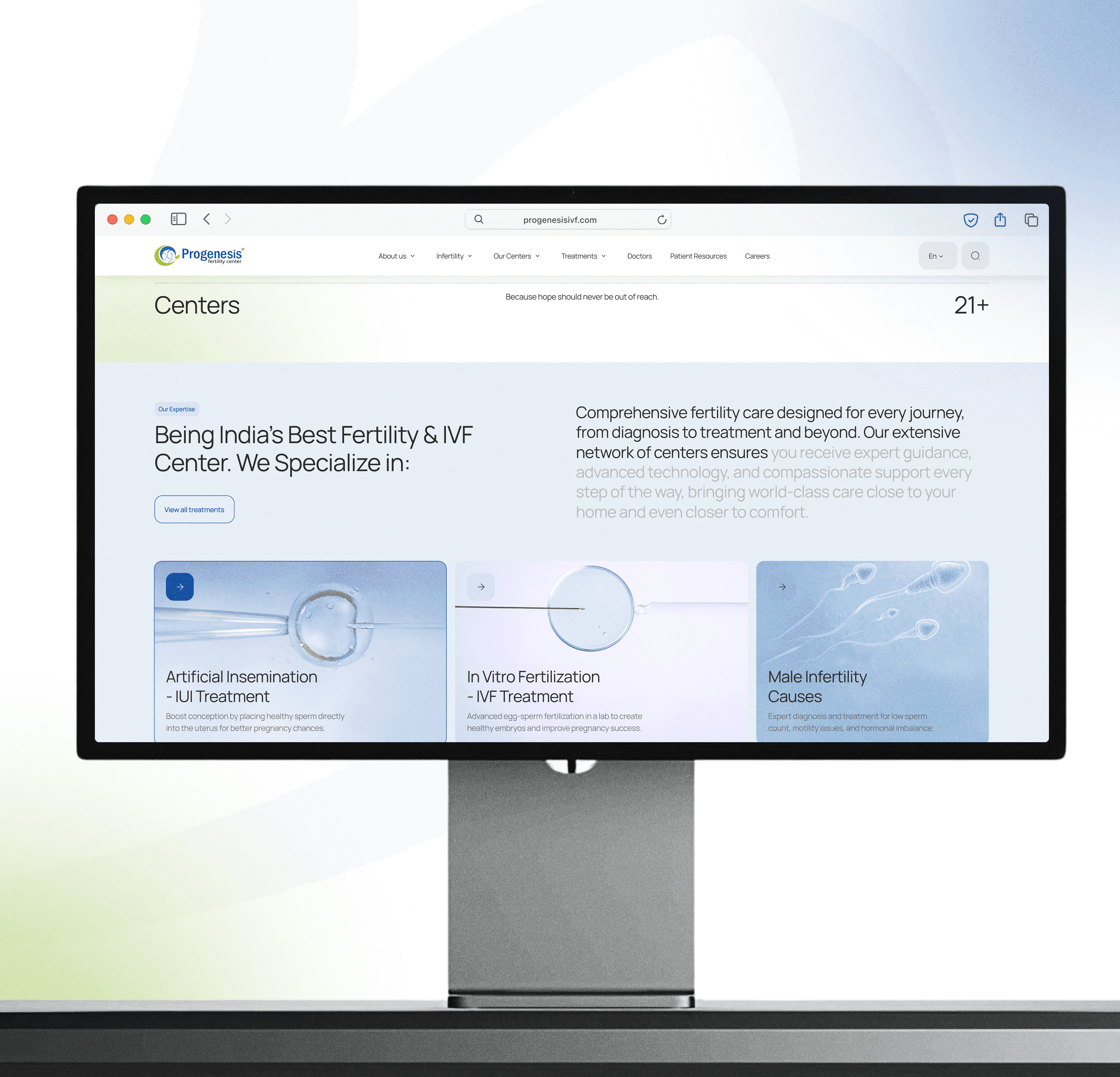
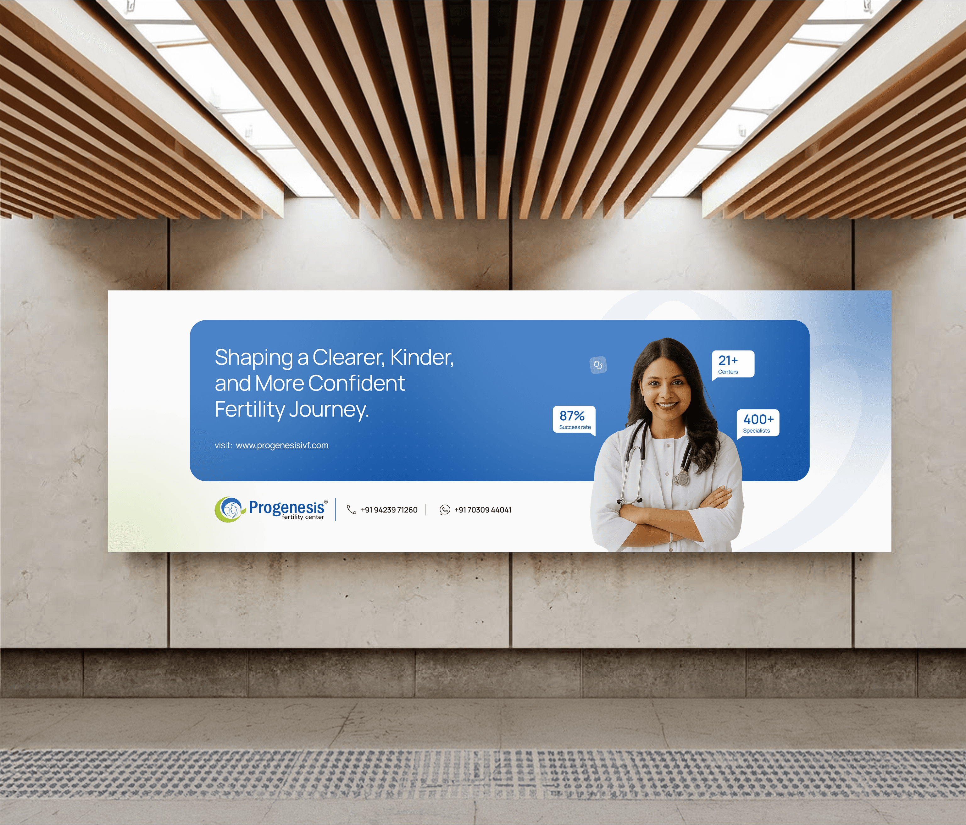
Progenesis IVF is one of India's largest fertility clinic networks with 21+ centers across Maharashtra, 32,500+ families helped, an 87% success rate, and 400+ specialists. By any measure, they're genuinely excellent at what they do.
The science was never the problem, but the experience of finding out about the science, that was the problem! A website that felt clinical in all the wrong ways. Information dense, emotionally cold, and built like a brochure for people who weren't already overwhelmed. Which, spoiler: their entire audience is overwhelmed.
//THE PROBLEM
( OR WHAT HAPPENS WHEN YOU DESIGN FOR THE INSTITUTION INSTEAD OF THE PERSON)
So here's the thing about healthcare websites, most of them are designed to impress the wrong person.
They're optimized for the clinic director nodding in approval during a demo. "Yes, all our services are listed. Yes, the doctors have photos. Yes, the awards are on the homepage."
Meanwhile the actual user, (someone who just got difficult news from their gynaecologist) who has seventeen tabs open, who is trying to understand what IVF even means is just drowning.
The Specific Problems:
Information architecture built around treatments, not around people's actual questions
No emotional acknowledgment anywhere. (Just procedures and packages)
Trust signals buried deep. Patient stories, success rates, real human proof were all hidden.
Mobile experience was an afterthought, despite most users arriving on phone, at odd hours, in private.
Every CTA was "Book Now" as if someone in that state is ready to book a platform ticket.
The website was talking at people. It needed to talk with them.
//WHAT I ACTUALLY DID
This was a full end-to-end digital redesign, not a reskin.
Complete information architecture overhaul, restructured around user intent rather than service categories.
Visual design system built around warmth: soft tones, human photography, unhurried layouts.
Patient journey mapping. (Understanding the emotional states at each touchpoint before touching a single screen)
Copywriting direction.(Tone of voice guidelines so the words matched the design)
Mobile-first redesign, because that's where the real conversations happen
Micro-interactions that made the experience feel considered, not transactional.
Developer handoff with full documentation.
//THE DESIGN MOVES
Lead with the human, not the procedure:
The old homepage hierarchy: Services → Doctors → Book Now. The new hierarchy: You're not alone → Here's what this journey looks like → Here are the people who'll walk it with you → Here's how to start. One is a catalogue. The other is a conversation.Patient stories before doctor credentials:
Counterintuitive for a medical brand. Right for this audience. When someone is scared, they don't want to read about a doctor's publications first. They want to know that someone who felt exactly like them sat in that same waiting room and left with something they didn't have before. Social proof before clinical proof.One CTA at a time. Always:
The old site had "Book Now," "Learn More," "Find a Centre," and "Call Us" competing on the same screen. We simplified every page to one primary action, contextually chosen. Less noise. More trust.Soft design language, intentionally:
Rounded corners. Warm off-whites. Photography that shows real faces. Typography that doesn't shout. In a category where everything is either sterile white or aggressively hopeful pink, we built something that felt calm, serious, and kind.
//DID IT WORK?
The new site did something the old one couldn't (It made people stay ! )
Not because it was flashy. Because it felt like it understood why they were there.
Bounce rates dropped. Appointment form completions went up, the feedback from patients was that the site felt like a place they could trust before they'd spoken to a single doctor, and I think…..
That's the goal. Not clicks. But Trust.
( Still here? Alright. This is where it gets personal. )
Designing for fertility is not like designing a usual website.
// THE HARD DECISIONS NOBODY ASKS ABOUT
How do you write about failure without destroying hope?
IVF doesn't always work the first time. Sometimes it doesn't work at all. That's the reality, and the audience knows it better than anyone, because most of them have already experienced some version of it.
The question was: does the website acknowledge this honestly, or does it stay relentlessly positive and risk feeling fake?
We landed on something in between. The copy never pretends every story ends perfectly. But it also never lets the weight of that possibility crowd out the genuine reason people are there. It's a tonal tightrope that required a lot of iteration, a lot of reading drafts out loud, and one very frank conversation about who we were actually writing for.
The accessibility problem nobody wanted to put in the brief.
A significant portion of Progenesis's audience is not highly English-literate. Many patients come from smaller cities and towns across Maharashtra (Dhule, Nanded, Jalgaon, Ratnagiri) where the primary language is Marathi. The website is in English. That gap is real and it affects how much a patient can actually absorb about their own treatment options before their first appointment.
We flagged it. We built the IA (Information Architecture) in a way that's ready for multilingual content. But the actual translation and regional content strategy was scoped out. It's a gap that's sitting there, and it matters.
Designing for a decision that takes months
Most product design is optimized for a single session, get the user to convert, complete the action, move on. Fertility journeys don't work that way. Someone might visit the website twelve times over six months before making an appointment. They might read the same page three times in different emotional states.
That changes how you think about every screen. It's not about the first impression only. It's about whether the tenth visit feels as trustworthy as the first. Consistency, depth of information, and emotional stability across the entire experience had to be designed as intentionally as the homepage.
// THE LOOPHOLES (WHAT DIDN'T MAKE IT INTO V1)
The patient portal was out of scope but very much on everyone's mind. Imagine a logged-in experience where patients can track their treatment cycle, receive personalised information based on their stage, and communicate with their care team without calling a front desk. That's the next level of this — and the architecture we built could support it. The content strategy and backend integration work is just waiting for the right phase.
The emotional design layer also only got partially implemented. There were ideas on the table for adaptive content. A website that could gently adjust its tone and emphasis based on signals like where someone entered from, how many times they'd visited, or which pages they'd spent time on. Not in a creepy personalization way. In a "we see you've been here a few times, here's what might actually help you now" way.
Beautiful concept. Not in this budget. Not this time.
//WHERE THIS GOES
Progenesis is growing, 21 centres today, more on the way. Every new centre needs a local content strategy, local trust signals, local patient stories. The design system we built was made for that kind of scale…
The multilingual content is coming. The patient portal will come. And the emotional design layer, the truly adaptive, truly personal experience, that's where this and the future of UX is all heading…
This wasn't a website redesign. It was the digital foundation for a healthcare brand that's going to keep mattering to more and more people…
So, For every family they haven't met yet, the site is ready <3